Since its founding, Les Arcs has fostered the same spirit: daring to take risks, experimenting, and reimagining the mountains. From architecture to new winter sports, from major events to today’s commitments, this culture of innovation shapes a unique identity.
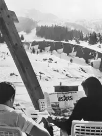
Les Arcs: A History in Dates
From alpine pastures to the birth of a high-altitude resort, the history of Les Arcs is that of a mountainous region that underwent transformation throughout the 20th century, while maintaining a strong connection to its environment and the people who bring it to life.
Beginning in the 1960s, the collaboration between Roger Godino, Robert Blanc, and Charlotte Perriand—supported by architects, urban planners, engineers, and local stakeholders—gave rise to an ambitious and profoundly innovative project.
This development was guided by a single vision: to create a resort integrated into the mountains, designed to be enjoyed year-round and in harmony with the landscape.
Over the decades, resort openings, innovations, major events, and recognition have marked this history and contributed to Les Arcs’ growing reputation.
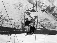
Winter activities began to take off on the northern slope of Bourg-Saint-Maurice. Two chairlift runs provide direct access to Courbaton, at an elevation of 1,750 meters, from the valley, making it easier to reach the snow.
The following year, the Biolley, Deux Têtes, and Signal ski lifts began operating in the Pierre Blanche area, forming the foundation for the initial development of the future Les Arcs ski area.
The municipalities of Bourg Saint Maurice and Hauteville-Gondon merged, at the initiative of their mayors, Albert Martin and Antoine Bimet. This merger marked a decisive step in the preparation of the future Les Arcs project.
An agreement was then signed with Roger Godino, the future developer of the resort: Bourg Saint Maurice provided financial guarantees, while Hauteville-Gondon made available the land necessary for the project’s development.
Arc 1600 welcomes its first vacationers at Christmas. The access road, hotels, apartments, and new ski lifts mark the birth of the first resort in Les Arcs.
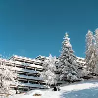
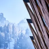
Led by Charlotte Perriand, a collective of architects envisioned a new way of building in the mountains: structures adapted to the slope, open to the landscape, and designed to blend into it. Arc 1600 thus became a true architectural laboratory, whose principles would guide the development of Les Arcs.
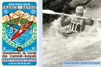
Bourg-Saint-Maurice became the first French city to host the Canoe-Kayak World Championships.
For six days, nearly 300 athletes from 16 countries competed on the Isère River. The French team stood out with 16 medals, while Claude Peschier won two world titles in kayaking.
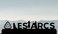
Founded by Roger Godino and Yves Petit de Voize, the Académie Festival des Arcs supports the development of the resort’s summer activities.
Inspired by the major American music academies, it is driven by a bold ambition: to bring together world-class musicians, pass on their knowledge to young artists, and share music with the public through the festival’s free concerts.
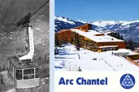
Arc 1800 welcomes its first visitors with the opening of the Hôtel du Golf and the Bellecôte and Miravidi residences. As the resort’s founding building, the Hôtel du Golf exemplifies the site’s architectural vision, with a structure that hugs the slope and blends into the landscape.
That same year, the cable car connecting Bourg-Saint-Maurice to Arc 1600 made it easier to reach the resorts from the valley and supported their development.
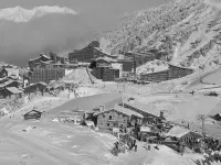
Designed by Bernard Taillefer around the Varet hill, Arc 2000 takes the form of a “fort” facing the sun and sheltered from the elements.
Its imposing volumes and sloping roofs, inspired by ski jumps, give it an instantly recognizable silhouette and reflect a new approach to high-altitude architecture.
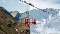
The Aiguille Rouge cable car takes you to the summit of the ski area, at an elevation of 3,226 meters. With no intermediate towers, it is a technical feat and has contributed to the development of high-altitude skiing.
This achievement exemplifies the spirit of innovation that characterizes Les Arcs, a pioneer in the development of mountain infrastructure and new winter sports.
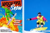
"Apocalypse Snow" showcases the latest snow sports in a short film that is as innovative as it is offbeat.
Starring Régis Rolland, aka “the Snowboard Genius,” and directed by Didier Lafond, this cult classic helped popularize snowboarding in Europe. Winner of six major international awards, it kicked off a trilogy that has since become legendary and left a lasting mark on several generations of riders.
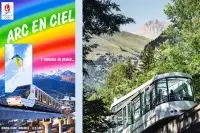
The funicular connects Bourg Saint Maurice to Arc 1600 in just 7 minutes. Directly connected to the SNCF train station, it allows travelers arriving on the TGV, Eurostar, and Thalys to access the resort and the slopes directly.
100% electric, it marks a new milestone in the history of mountain transportation and has become a symbol of sustainable and innovative mobility in Les Arcs.
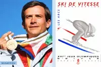
Arc 2000 hosted the speed skiing events of the Albertville Olympic Games, which took place on the legendary “Kilomètre Lancé” course.
Featured as a demonstration sport, the discipline saw Finland’s Tarja Mulari take the win at 219.245 km/h, while France’s Michaël Prüfer reached 229.299 km/h.
Born out of a partnership between Quiksilver and Les Arcs, the Quikcup and later the Quiksilver Slopestyle Pro have helped make the resort an international hub for freestyle snowboarding.
The world’s best riders gather at Les Arcs’ snowpark for a competition entirely dedicated to slopestyle. Hips, tables, a half-pipe, and jib features come together to create a spectacular playground for the latest snow sports.
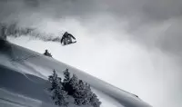
As the winter’s flagship event, La Freeride Les Arcs brings together professional skiers and telemark skiers for an extreme skiing competition, which has since become a World Tour final.
Led by the “Ça Envoie du Gros” team and organized in collaboration with Dino Raffault, the event brings together a team of enthusiasts and, alongside Rip Curl and The North Face, asserts a strong identity: freeride, nothing but freeride.
Les Arcs is hosting its first Alpine Ski World Cup event on the Cachette course in Arc 1600, featuring a men’s giant slalom and a men’s slalom.
In the giant slalom, Switzerland’s Michael von Grünigen took the win ahead of Austria’s Benjamin Raich. He received a prize that was as unexpected as it was symbolic: Lambada, a Tarine cow—a nod to the region’s Savoyard heritage.
Created on the initiative of Éric Siri, the Les Arcs Comedy Festival has been a highlight of the resort’s summers for several years.
Driven by a spirit of solidarity, it supports the Soleil d’Enfance association, which works with children with disabilities. Big names in French comedy take the stage one after another in a festive, generous, and friendly atmosphere.
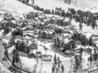
Developed by Intrawest, Arc 1950 offers a new model for a resort: a high-end, 100% pedestrian-friendly village that’s bustling year-round, seamlessly integrated into the ski area.
Its hybrid architectural style, inspired by both traditional Alpine villages and North American resorts, combines slate, stone, and wood to create a warm and instantly recognizable identity.
The Vanoise Express cable car connects the Les Arcs/Peisey-Vallandry and La Plagne ski areas in just 4 minutes, creating Paradiski.
With a speed of 12.5 m/s and an exceptional span without support towers, this extraordinary cable car has become one of the ski area’s major engineering landmarks and marks a new milestone in the history of mountain ski lifts.
Les Arcs has been awarded the 20th-Century Heritage Label, granted by the Ministry of Culture to recognize the century’s major architectural achievements. Renamed the “Remarkable Contemporary Architecture” label in 2016, it recognizes pioneering architecture designed in harmony with the terrain and landscape.
In Bourg-Saint-Maurice – Les Arcs, five sites have been awarded the label: the town hall and community center in Bourg-Saint-Maurice, the urban planning and architecture of Arc 1600 and Arc 1800, as well as the stations of the Aiguille Rouge cable car in Arc 2000.
Organized by François Bon, a local rider and pioneer of the sport, The Speed Flying Pro Les Arcs has become one of the premier events in speedflying.
The world’s best pilots gather in Les Arcs to compete in this spectacular sport, which is a cross between gliding and flying. The event’s technical competitions help shape the discipline and lay the groundwork for its international circuit.
Founded by Pierre-Emmanuel Fleurantin and Guillaume Calop, both natives of Bourg-Saint-Maurice, the Les Arcs European Film Festival has become one of the resort’s major cultural events.
Each year, it kicks off the winter season with a program dedicated to European arthouse cinema. Screenings, industry meetings, and appearances by renowned directors and actors highlight the event, while a different European country is featured each year.
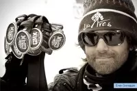
Conceived and organized by Enak Gavaggio, an iconic figure in skicross and Les Arcs, the Gavaggio Monster Cross supports the emergence of young talent in the sport.
Over four days, participants benefit from the experience and advice of the champion, a seven-time X Games medalist. Open to young people whether or not they are licensed, the competition combines fun, mentorship, and sportsmanship in an atmosphere that reflects the “Dark Lord” of ski cross.
Born out of a partnership between Red Bull and Les Arcs, the Red Bull Linecatcher has established itself as one of the premier events in backcountry freeskiing.
Blending freestyle and freeride, the competition brings together the world’s best riders on spectacular natural terrain, featuring couloirs, rocky outcrops, steep slopes, and kickers integrated into the landscape. Fluidity, technical skill, and creativity are at the heart of the event.
Conceived by Henrik Harlaut (E-Dollo) and Phil Casabon (B-Dog), the B&E Invitational marks a new chapter in the history of freestyle skiing.
Designed as an extravagant, playful, and creative playground, its course combines halfpipes, bowls, quarters, rails, and transfers. By bringing together 19 leading figures in the sport, including Candide Thovex, the event reaffirms Les Arcs as a premier venue for new snow sports.
Les Arcs – Bourg Saint Maurice has become the first destination in Savoie to receive the Flocon Vert certification, awarded by the Mountain Riders association.
This distinction recognizes a collective effort to promote more responsible tourism, led by local stakeholders addressing environmental, social, and economic issues.
The Les Arcs / Peisey-Vallandry Mountain Resort has become the first mountain resort operator in Europe to earn B Corp™ certification.
Internationally recognized, this certification distinguishes companies that meet high standards in social and environmental performance, transparency, and accountability. This recognition reflects a strong ambition: not to be the best in the world, but to be better for the world.
A logo that stands the test of time
1969 – When Architecture Becomes a Logo
A leading figure in postwar French graphic design, Pierre Faucheux also expanded his work into the fields of urban planning and architecture. In 1967, he joined the team led by Charlotte Perriand to help design Les Arcs.
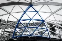
At Arc 1600, he designed the Coupole, whose glued-laminated timber frame served as the graphic basis for the creation of Les Arcs’ first logo. The logo echoes the lines of its structure and evokes three peaks, referencing the three sites then under consideration: Arc 1600, Arc 1800, and Arc 2000. Its silhouette also resembles a ski tip.
From its very inception, the logo thus embodied the essence of Les Arcs, at the intersection of architecture, the mountains, and winter sports.
2002 – The Logo Gets Color
Les Arcs’ logo evolves into a bolder, more contemporary identity. Warm colors reinforce its welcoming character, while the handwritten typeface adds movement and spontaneity.
This new identity projects a more modern, warm, and dynamic image.
2006 – Les Arcs Joins Paradiski
The “Paradiski” signature is incorporated into the logo, affirming Les Arcs’ place within a large interconnected ski area, alongside Peisey-Vallandry and La Plagne.
The logo thus conveys a new dimension of the destination and its place within the Paradiski identity.
2012 – The Logo Is Streamlined
Les Arcs’ logo evolves to modernize the resort’s image and improve readability. The four-color version gives way to a more understated, streamlined, and contemporary identity.
2016 – A Return to Its Roots
Les Arcs revisits its historic logo by reworking its typography, the balance of its elements, and the symbol inspired by the Coupole.
This new identity brings the “Les Arcs” brand back to the forefront and reaffirms what makes it unique: architecture, innovation, and a spirit of adventure.
2019 – Blue as a Legacy
To mark Les Arcs’ 50th anniversary, the logo returns to its original color and adopts a dark blue that is both understated and elegant.
This evolution reaffirms the connection to the resort’s graphic heritage while giving its identity a more contemporary look.